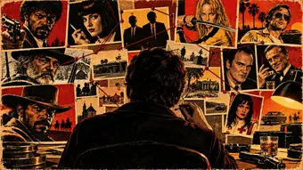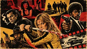
Quentin Tarantino’s visual style directs attention through camera positions, changes in scale, and relationships between bodies and spaces. A character can dominate the image from a low angle or remain exposed within a wide frame. Distance has no fixed effect: moving closer lets us observe a reaction, but can also hide what is happening around it. The shape of the shot determines what information we share with the protagonists and what we can notice before they do.
Movement, lighting and editing complete this distribution. A slow push-in changes the intensity of a conversation; a cut can reveal a threat or delay the answer we are expecting. Colour and costume help distinguish figures within a composition, while focus establishes relationships between different areas of the image. These elements work together. The result depends on the dramatic situation and the coordinated work of directing, cinematography, design and editing, with solutions that vary from film to film. The breadth of a Western set indoors and the intensity of a criminal confrontation call for different ways of making danger visible.
The image in Tarantino’s cinema manages power relationships and the amount of information shown. An isolated face lets us focus on a hesitation; several characters in the same shot make us divide our attention. The choice depends on the conflict and can change during a scene. Style emerges from this arrangement, as well as from recognisable techniques such as low camera positions, sudden changes in scale and compositions featuring intense colours.
Framing and focus: where to look within the shot
The boot shot places the camera low, facing characters looking into the car. The edge of the space and the direction of their gazes create a specific relationship between those who are looking and what they are looking at. Its effect depends on the context: the position can give a group presence, create curiosity about what it conceals or introduce a sense of vulnerability.
The overhead shot offers another spatial arrangement: the camera looks straight down. This perspective lets bodies, objects and pathways be arranged as parts of a surface. By contrast, a canted frame changes the orientation of the lines within the image. Neither technique inherently implies a single emotion; its relationship with movement, performance and nearby shots determines the effect.
The split-diopter focus keeps two areas at different distances sharp using a partial optical attachment. In the June 2019 issue of American Cinematographer, Jay Holben cites Reservoir Dogs as an example. The technique creates two distinct planes of focus, with a transition that can be visible. It lets a nearby element be related to a distant one without bringing the entire space between them into focus.
Movement and format: changing position or scale
A zoom changes the lens’s focal length and the field of view. A tracking move physically moves the camera and changes its position in relation to elements in the scene. The explanation of American Cinematographer on camera movement tools distinguishes a dolly move from its possible combination with a zoom. A crash zoom speeds up the change in scale to create a visual accent; physically moving closer also changes perspective relationships.
The relationship between a long take and a tracking shot requires us to distinguish duration from movement. A long take sustains a dramatic unit without visible cuts and may include a stationary camera. A tracking shot can be brief. Steadicam refers to a stabilisation system, not a particular duration. On screen, tracking lets us discover a space while following a character through it.
In his 2019 conversation with Scorsese, published by the DGA, Tarantino credited Josef von Sternberg with tracking between foreground set elements, a technique he recalled using in Inglourious Basterds. The set dressing adds layers of depth as the camera moves.
American Cinematographer documents the use of 65 mm negative, 70 mm prints and a 2.76:1 image in The Hateful Eight. The capture medium, exhibition format and frame proportions describe different decisions. The wide space allows several reactions to be set against one another at once.
Lighting, design and editing: building visual continuity
Lighting determines which parts of a space are exposed and how faces stand out from the background. Tarantino’s use of colour also incorporates sets and clothing: the dark suits in Reservoir Dogs establish a sense of group unity, while the Bride’s yellow in Kill Bill sets her apart visually from many of her opponents. Costume and character identity therefore play a part in how we read the frame at a glance.
A shift to black and white can break that colour continuity and change how a sequence feels. The effect is related to where it appears and the images around it. The same visible choice does not always demonstrate the same production motive or carry the same meaning in time.
Editing determines how long a reaction lasts and what information the next shot provides. A scene can alternate between the face of the person asking a question and the person who needs to answer, or keep them together so the tension depends on both. Tarantino’s crew coordinates these possibilities from filming through to editing; lighting and design make the elements legible for editing to bring together.
Words printed on screen are also part of the image. In Kill Bill, the chapter headings interrupt the flow of the action and give a name to the section that begins. Their appearance creates a recognisable pause, with its own duration and visual weight before the characters return to the screen.
The size, colour and position of a letter can create a sense of solemnity, energy or popular spectacle. Typography shares the frame with faces, objects and backgrounds, or replaces them for a few seconds. This shift makes us move from watching an action to reading information, changing the rhythm of our attention.
The credits also present names and responsibilities through a graphic arrangement. Their informational purpose sits alongside the music and the tone of the opening. When text appears over a moving shot or an empty background, it creates a different relationship between reading and movement. A film’s visual identity also begins to take shape through these choices.